Coffee - Coffee Zine

Overview
Responsibilities: Graphic Design
Timeline: April, 2025
Tools: Adobe Indesign, Photoshop
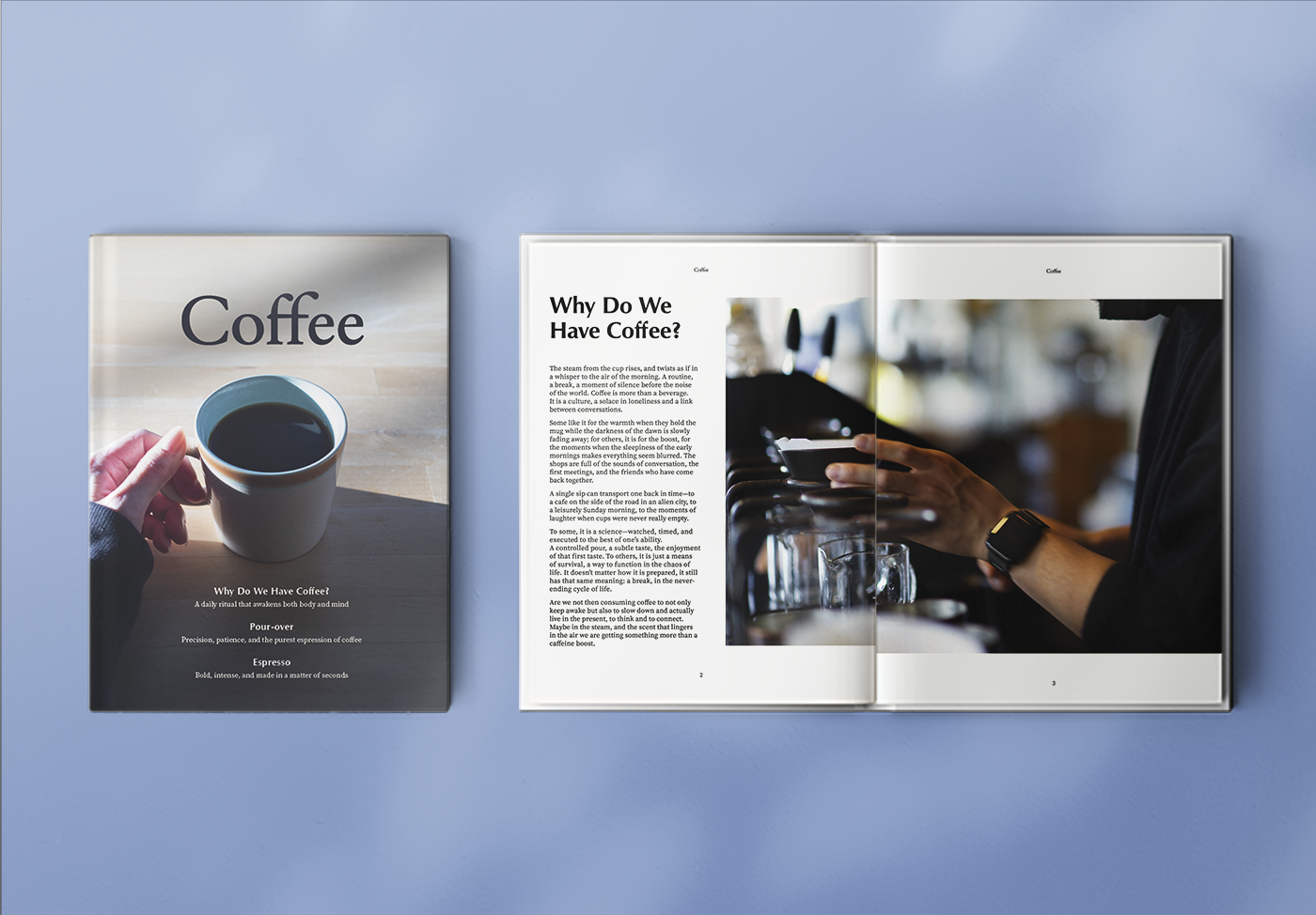
During my studies at Langara College, I created a zine as an assignment for Advanced Typography. I was responsible for all of the photography, design, and typography selection, and created the zine from scratch.
Design & Authentic Choice
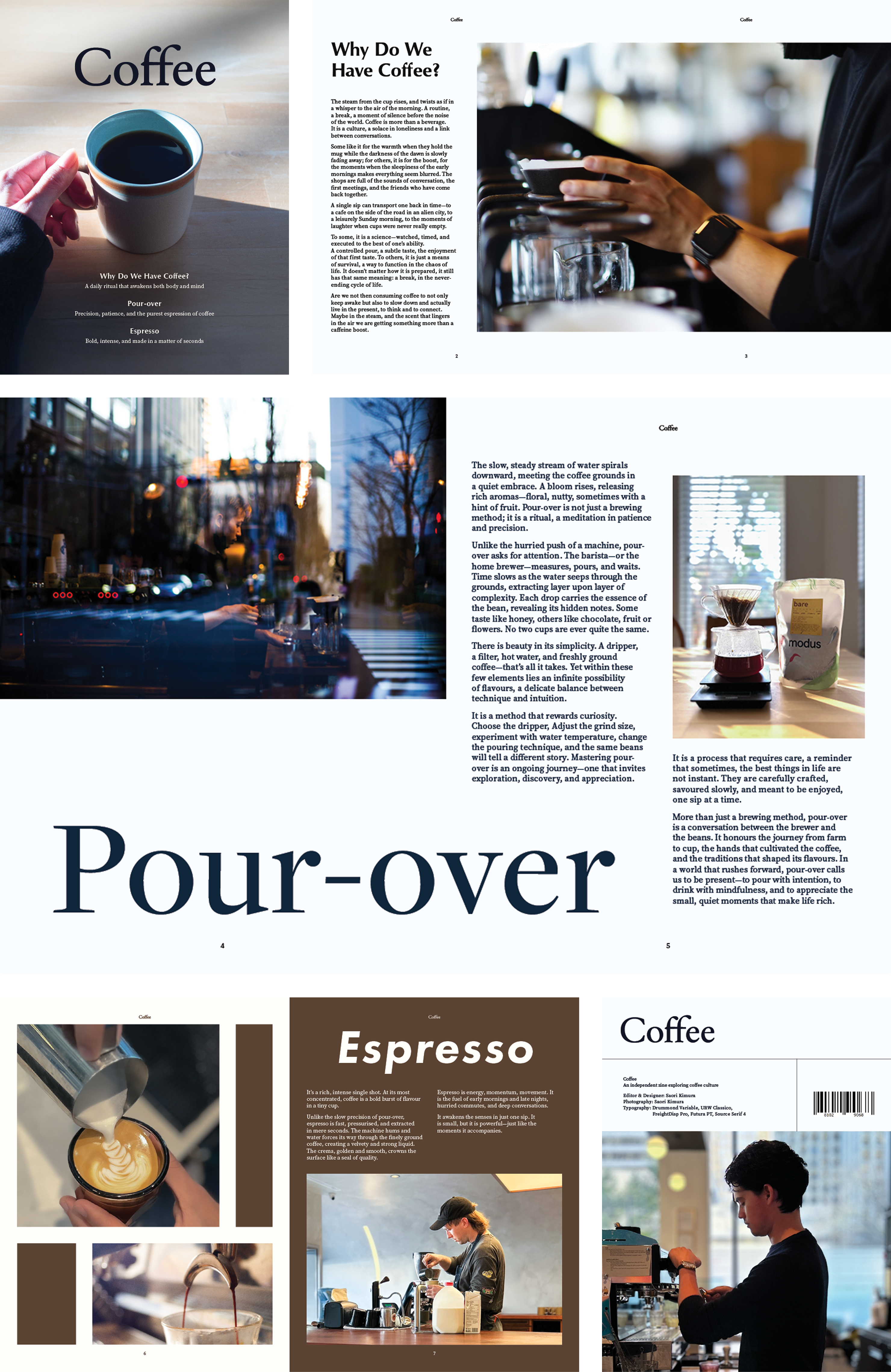
The design follows a minimal and sophisticated approach, avoiding unnecessary decorations and instead relying on typography and photography as the main visual elements. The colour scheme is predominantly monochrome.For the logo, I chose Drummond Variable, a soft, beautiful flowing curve that complements the movement and texture of the cover photo. In order to preserve harmony with the overall aesthetic, I ultimately chose to leave it in its pure typographic form.
Typography & Layout
Each typeface was carefully selected to enhance the mood of the zine:
URW Classico for a refined yet approachable text
FreightDisp Pro for its strong yet elegant presence in headings for the Pour-over page
Source Serif 4 to maintain overall balance and readability
The “Why Do We Have Coffee?” and “Pour-over” pages contribute to building the overall atmosphere of the zine. The Pour-over section in particular has bold margins in the layout to best express its features. The Espresso section introduces a deliberate contrast in both design and typography. The heading uses Futura PT Heavy Oblique to visually convey the speed, boldness, and intensity of espresso. The background colour and layout are slightly different from the rest of the pages, adding a sense of energy while maintaining overall cohesion. Using the same typeface for the body text remains consistent to ensure readability and unity across the pages. The photographs retain the same tonal qualities to preserve a seamless visual flow.
